


Key Takeaways
- The Red Cross, Rod of Asclepius, Caduceus, and Star of Life are the best-known historic medical symbols, and each has a different origin story.
- Modern hospital wayfinding relies on standardized pictograms for restrooms, elevators, emergency rooms, and accessible routes.
- The International Symbol of Access, the wheelchair icon, has been the international accessibility standard since 1969.
- Poor hospital wayfinding is not just a comfort issue. One widely cited estimate put its labor cost at roughly $220,000 a year at a single hospital.
- Facilities that plan symbols and signage as one coordinated system, instead of adding pieces over time, see fewer wayfinding complaints from patients and staff.
What Counts as a “Universal” Hospital Symbol
A symbol earns the label “universal” when it means roughly the same thing to a patient in Dallas as it does to one in Berlin or Tokyo. That consistency matters more in a hospital than almost anywhere else, because the people reading the signs are frequently stressed, in pain, or unfamiliar with the building.
Universal hospital symbols fall into two broad categories. The first is historic and cultural: emblems like the Red Cross or the Rod of Asclepius that represent medicine and healing as an idea, not a specific room or task. The second is functional: pictograms built for wayfinding, drawn from standards like the ADA’s International Symbol of Access or a hospital’s own icon set for departments and hazards.
Both categories matter to a facility manager speccing new signage. The historic symbols shape how a hospital is branded and recognized from the street. The functional pictograms determine whether a visitor can find the emergency room without asking three different staff members for directions. A frequently cited estimate from a study of wayfinding at Emory University Hospital put the cost of confused staff and visitors at roughly $220,000 a year in lost labor time (cited in a peer-reviewed environmental psychology review published via PubMed Central). Clear, consistent symbols are one of the most direct fixes available.
The Historic Symbols Behind Every Hospital’s Identity
Long before pictogram wayfinding existed, a handful of emblems came to represent medicine itself. You’ll still see all of them on hospital exteriors, ambulances, and staff uniforms today.
The Red Cross (and Red Crescent)
The red cross on a white field is the most recognized medical symbol in the world, and it did not start as a hospital sign. It comes from the 1864 Geneva Convention, where the symbol was chosen partly as a reversal of the Swiss flag’s colors, a nod to the Swiss origins of the Red Cross movement. Under international law, firing on anyone or anything displaying the emblem is a war crime, which gives the symbol a formal, protected status that most hospital signage does not carry. In some countries, the Red Crescent or Red Crystal is used instead, for the same legal purpose.
The Rod of Asclepius
A single serpent coiled around a plain staff is the Rod of Asclepius, named for Asclepius, the Greek god of healing and medicine. It appears on the World Health Organization’s logo and on the seals of many national medical associations, and it’s the symbol organizations actually intend when they reach for “a snake on a stick.” The snake itself is a deliberate choice: in ancient symbolism, a snake shedding its skin represented renewal and healing, which is part of why the image has outlasted almost every other medical emblem. You’ll find the Rod of Asclepius on ambulance graphics, pharmacy signage, and hospital directories, often standing in for “medical facility” the same way a cross does.
The Caduceus
The two-snake, winged staff you’ll see on some medical uniforms and older hospital signage is the caduceus, and it’s historically a symbol of commerce and messengers, carried by the Greek god Hermes, not medicine. The mix-up traces back to a U.S. Army Medical Corps officer in the early 1900s who confused it with the Rod of Asclepius. The error stuck, and today both symbols circulate in healthcare branding even though only one has a real claim to the meaning.
The Star of Life
The six-pointed blue star with the Rod of Asclepius at its center is the Star of Life, developed for U.S. emergency medical services. Each of its six points stands for a stage of emergency care: detection, reporting, response, on-scene care, care in transit, and transfer to definitive care. You’ll see it on ambulances, EMS uniforms, and increasingly on emergency department entrance signage.
Quick Reference: Historic Medical Symbols
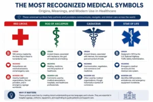
| Symbol | Origin | What It Represents |
| Red Cross | 1864 Geneva Convention | Protected medical status; general healthcare |
| Rod of Asclepius | Greek mythology (Asclepius) | Official medicine and healing; used on the WHO logo |
| Caduceus | Greek mythology (Hermes) | Commerce and messengers; mistakenly adopted for medicine |
| Star of Life | U.S. EMS, 20th century | The six stages of emergency medical care |
Universal Pictograms Used in Hospital Wayfinding

Once you’re inside the building, hospitals lean on a second, more practical layer of universal symbols: pictograms designed to be understood without reading a single word of English, or any language.
Emergency and Urgent Care Symbols
Emergency departments use some of the most standardized symbols in any building type, because delay has real consequences. A red cross or a stylized “ER” mark, paired with high-contrast red or orange coloring, tells visitors at a glance where to go without slowing down to read text. Exterior signage often repeats this symbol at the building perimeter and again at the entrance drive, since drivers need to identify it from a distance.
Restroom, Elevator, and Accessibility Symbols
Restroom pictograms, the familiar male and female figures, elevator icons, and stair symbols are governed by ADA and building code requirements in nearly every U.S. jurisdiction, which is part of why they look almost identical from one hospital to the next. The accessibility symbol, the International Symbol of Access, deserves its own mention: it was designed in 1968 by Danish design student Susanne Koefoed and adopted internationally the following year. More than fifty years later, it remains the standard mark for accessible entrances, parking, and restrooms in nearly every country with an accessibility code.
Department and Specialty Icons
Larger hospitals use icon sets to mark individual departments: a heart for cardiology, a lung outline for pulmonology, a stethoscope for general practice areas, an eye for ophthalmology. These icons aren’t governed by a single federal standard the way ADA symbols are, so they vary more between hospital systems, but the best-designed sets stay simple enough that a first-time visitor can guess the department correctly without reading the label underneath.
Safety, Hazard, and Regulatory Symbols
Hospitals also carry a layer of symbols aimed at staff and safety compliance rather than visitors: the three-ringed biohazard symbol on sharps containers and waste bins, a cigarette with a red slash paired with an oxygen tank icon near oxygen supply lines, and wheelchair or gender symbols on restroom doors. These aren’t optional design choices. Most trace back to OSHA or local fire code requirements, and a sign company working on a hospital project needs to know which symbols are regulatory and non-negotiable versus which are wayfinding conventions that leave room for design choices.
Color’s Role Alongside Universal Symbols
Symbols rarely work alone. Hospitals pair them with a fairly consistent color language, and getting the color wrong can undercut a perfectly good icon.
Red marks emergency, danger, or restricted access: emergency room signage, fire equipment, biohazard warnings, and “do not enter” symbols almost always use red backgrounds or red framing. Blue is reserved for information and accessibility: ADA signage, general wayfinding, and the International Symbol of Access are conventionally rendered in blue and white, which is also why the standard highway “Hospital Ahead” road sign uses a white H on a blue field. Green typically marks safe egress: exit routes, emergency evacuation signage, and first aid stations. Yellow and black striping signals caution, most often for wet floors, physical hazards, or areas under construction.
None of this is arbitrary. Life-safety and fire codes specify colors for many safety and emergency-related signs, so a hospital, or the sign company working with one, doesn’t have full discretion on those elements. Where a facility does have room to make its own decisions is in its branded wayfinding, department icons, and floor numbering, and that’s where staying consistent from floor to floor matters most.
ADA Compliance and Universal Symbols
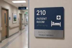
Universal symbols and ADA compliance overlap constantly in a hospital, but they aren’t the same requirement. ADA signage law governs specific things: tactile characters and Grade 2 braille on permanent room identification signs, minimum character height and contrast ratios, and consistent mounting height, typically 48 to 60 inches to the baseline of the tactile characters, measured from the finished floor. The International Symbol of Access must appear wherever an accessible route, entrance, restroom, or parking space exists.
Universal symbols, by contrast, aren’t always legally required. A hospital can choose its own icon for “cardiology” or design its own directional arrow style, as long as the ADA-covered elements, tactile signs and accessible route markers, meet code. The practical challenge for most facilities is coordinating the two: an ADA-compliant room sign and a hospital’s custom wayfinding icon need to sit on the same wall without competing for attention or contradicting each other in color and symbol logic.
Planning Universal Symbols for a New or Renovated Facility
When we design signage for medical and dental facilities across McKinney, Plano, and the rest of North Texas, the biggest mistake we see isn’t a missing symbol. It’s inconsistency: a facility that uses one restroom icon on the first floor and a different one on the second, or a wayfinding system that was clearly built in phases as the building expanded.
A few practices we recommend to every healthcare client:
- Standardize before you order signage, not after. Pick one icon set for departments, hazards, and restrooms, and document it before fabrication starts, so every sign made over the life of the building matches.
- Separate regulatory symbols from branded ones. ADA tactile signs, biohazard symbols, and fire code markers should never be redesigned to match a color palette. Save custom branding for directional and department signage instead.
- Plan for renovation. Hospitals change layouts more than almost any other building type. A modular sign system, where panels can be swapped without replacing the whole sign, saves real money over a five- or ten-year horizon.
- Coordinate with the permit process early. North Texas municipalities review ADA-related signage as part of permitting, and catching a compliance gap before installation is far cheaper than catching it during inspection.
Frequently Asked Questions
What are common symbols in healthcare?
The most common healthcare symbols are the red cross, the Rod of Asclepius (a single snake on a staff), the Star of Life used by EMS, and the International Symbol of Access for accessible routes and entrances. Hospitals also rely on functional pictograms for restrooms, elevators, and emergency areas that follow the same logic in nearly every country.
What symbols and signs are commonly used in hospitals?
Hospital signs use a mix of regulatory symbols, ADA tactile signage, biohazard warnings, no-smoking-near-oxygen icons, and wayfinding symbols like directional arrows, department icons, and restroom or elevator pictograms. Regulatory symbols are set by codes like the ADA and OSHA, while wayfinding symbols vary more by facility, though most follow shared conventions such as red for emergency and blue for accessibility.
What is the symbol of nurses?
Nursing doesn’t have one single official symbol, but three show up most often: the oil lamp associated with Florence Nightingale, the now-retired nurse’s cap, and the Rod of Asclepius shared with medicine broadly. The lamp is the most historically specific to nursing, since Florence Nightingale carried one while checking on patients at night.
What is the meaning of medical symbols?
Medical symbols exist to communicate health, healing, or medical services without relying on written language. Most trace back to one of two roots, mythology (the Rod of Asclepius, the caduceus) or organized medicine’s own history (the Red Cross, the Star of Life), and each carries a specific origin story rather than one shared meaning.
What does the snake on the medical symbol mean?
The snake represents renewal and healing, based on the ancient belief that a snake shedding its skin symbolized recovery and long life. It appears in both the Rod of Asclepius, one snake and no wings, and the caduceus, two snakes with wings, which is the main reason the two symbols get mixed up.
Is the caduceus the correct symbol for medicine?
Not historically. The caduceus, a winged staff with two snakes, is the emblem of Hermes and originally represented commerce and messengers, not medicine. It became associated with healthcare after a U.S. Army Medical Corps officer mistook it for the Rod of Asclepius in the early 1900s, and the mix-up has persisted in some medical branding ever since.
Working With a Sign Company That Understands Hospital Signage
Getting universal symbols right is only half the job. The other half is making sure they’re fabricated, placed, and maintained the way the code, and your visitors, need them to be. If your facility is planning a new wayfinding system or updating an existing one, Vantage Point Signs designs and installs ADA-compliant hospital and medical facility signage throughout McKinney, Plano, Frisco, Dallas, and the rest of North Texas. Explore our directional and wayfinding signage or our ADA and braille signage services to see how we approach a project like this from concept through installation.